HeadWay Case Study
May - July 2020
Role
Design Consultant
(Freelance)
Deliverables
Branding, UX & Visual Design,
Web Design & Development,
Marketing Design, Copywriting
Brand, website, copy, UX and collaterals for a healthcare recruitment business
Client
Based in London, UK, HeadWay is a brand new healthcare recruitment company that bridges the gap between healthcare providers in the UK, and medical professionals in India and the Philippines.
Challenge
As the sole designer, my goal was to embrace HeadWay's business values and create their complete brand personality from scratch. They needed to launch with gusto and enter the recruitment market in a professional and memorable fashion.
Solution
A thorough discussion with the client, I discovered what sets HeadWay apart from the rest. With a refreshing visual identity and a modern eye-catching logo, an engaging responsive website, and the basic marketing collaterals, HeadWay was able to launch proudly and enter the healthcare recruitment sector with a strong and memorable brand.
Design Process
01
Discover & define
I discussed with HeadWay their values, business goals and USP to strategise the best way to move forward, outlining phases ahead and defining deliverables and realistic timelines.
02
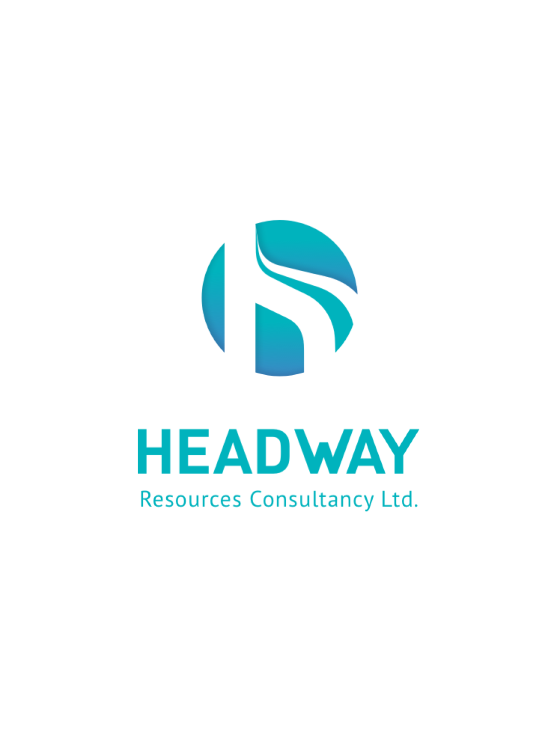
Logo design
First step was to research and propose a responsive logo that reflected HeadWay's values, designing the chosen logo's applications on digital/print mockups.
03
Visual identity
I then created a moodboard in order to define the visual direction and updated the logo mockups accordingly. I also chose a visual theme that would carry through the brand.
04
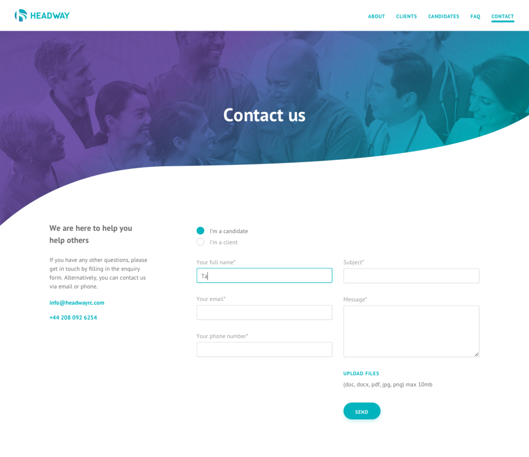
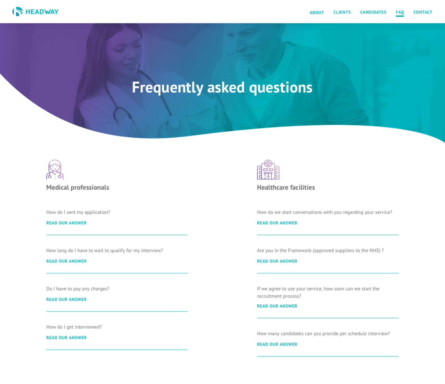
UX & copywriting
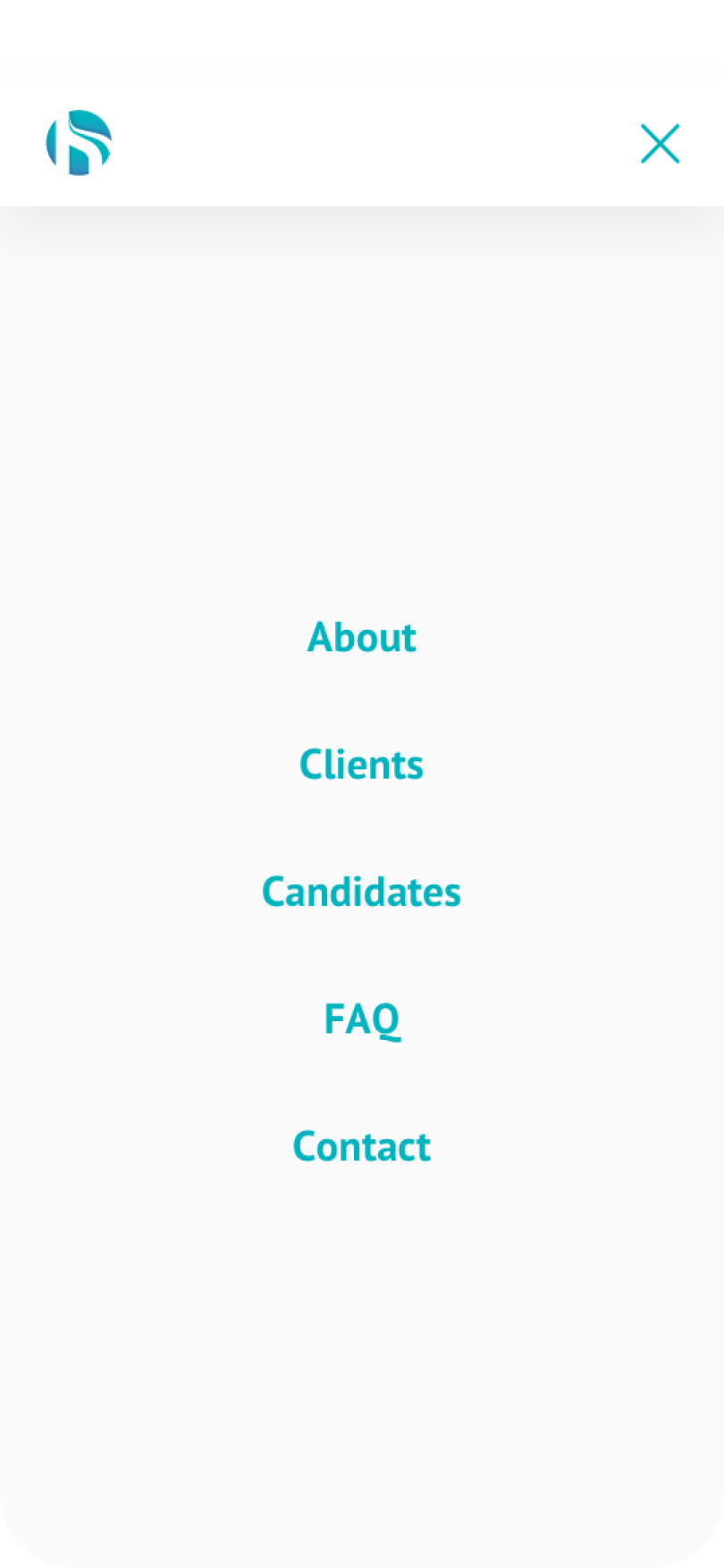
After defining a simple website structure to ensure the info flow, engagement and aesthetics are optimal, I rewrote the content provided by HeadWay with a more personal voice in keeping with HeadWay's empathic recruitment services.
05
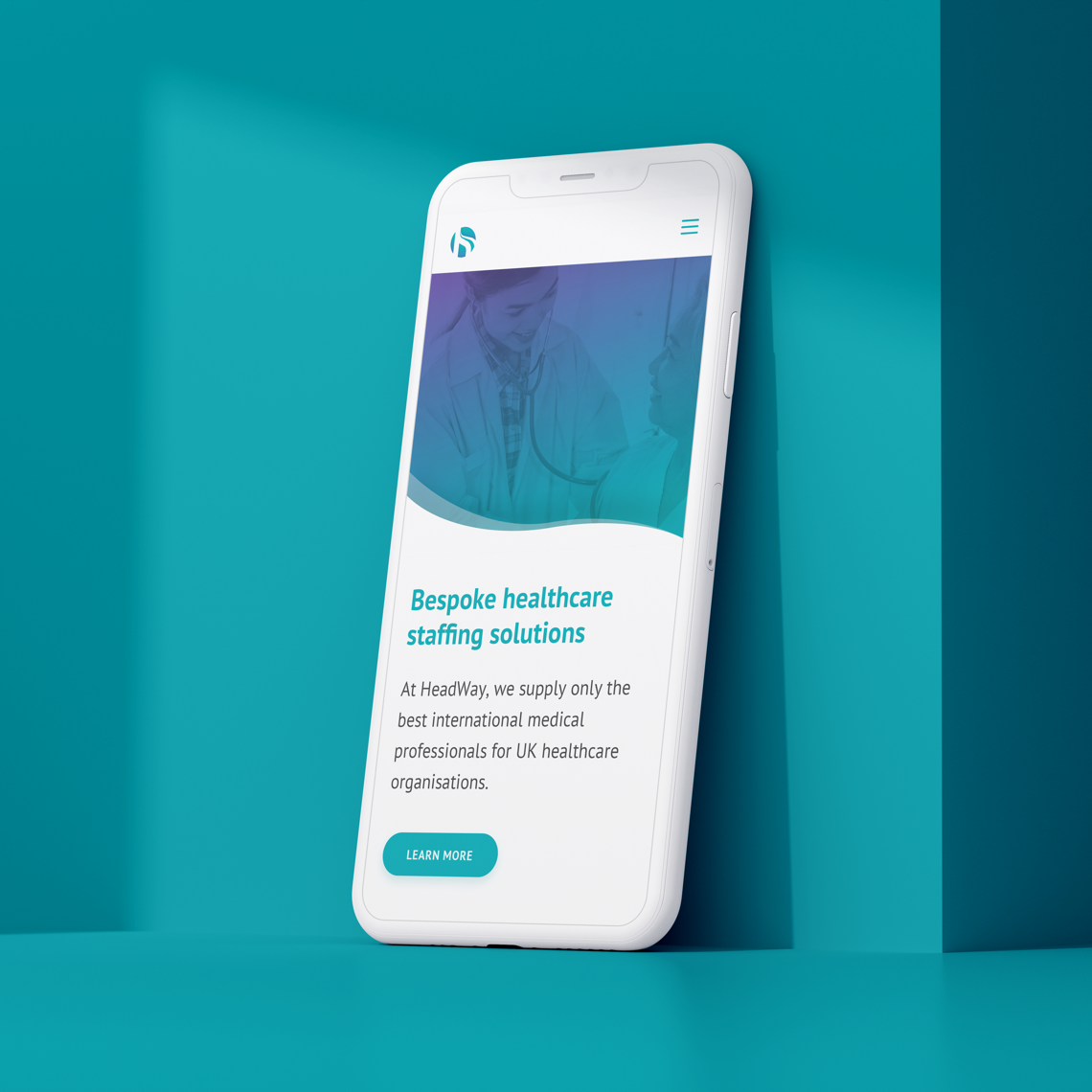
Website design & dev
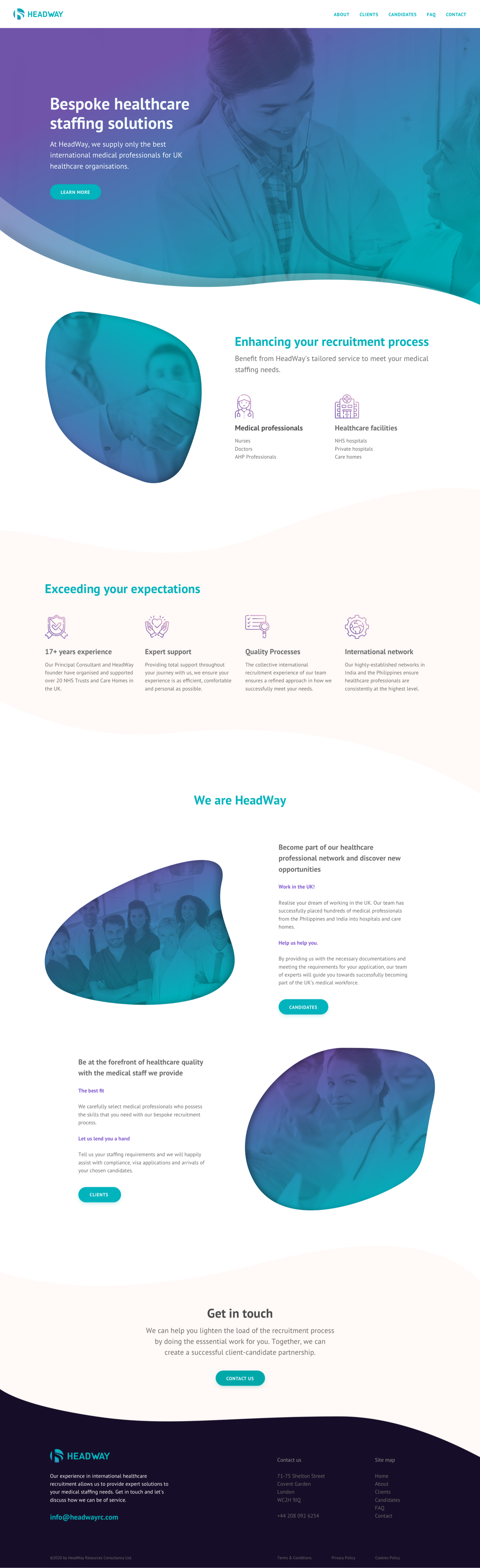
Design/develop the responsive website via a Wordpress website builder (Semplice), ensuring all visual elements support the page contents in an engaging manner across various web and mobile devices.
06
Marketing collaterals
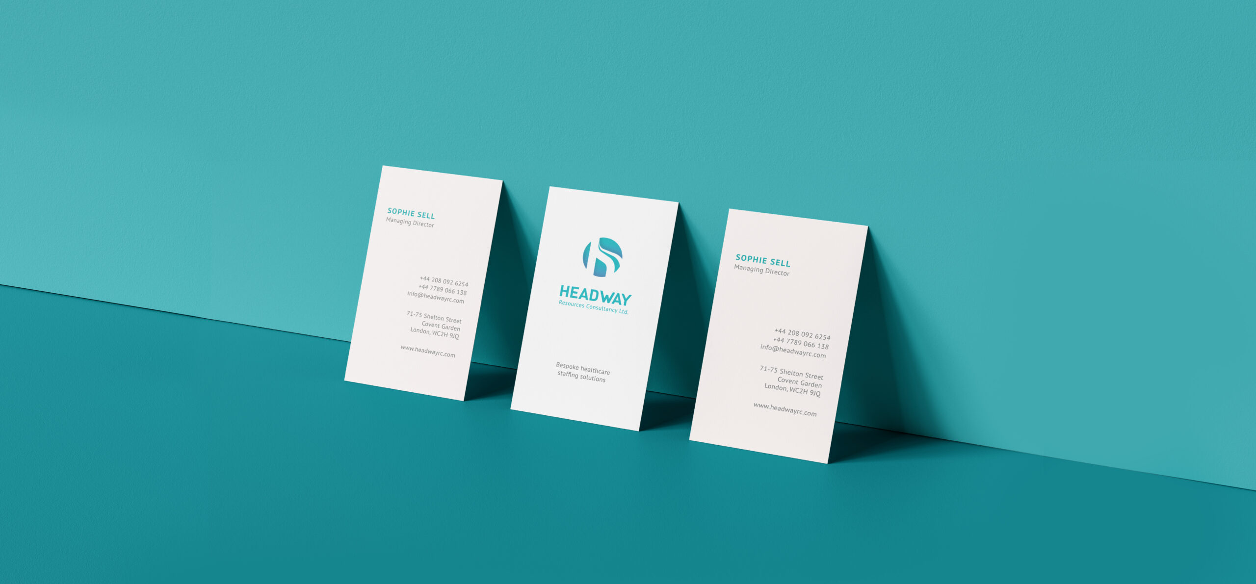
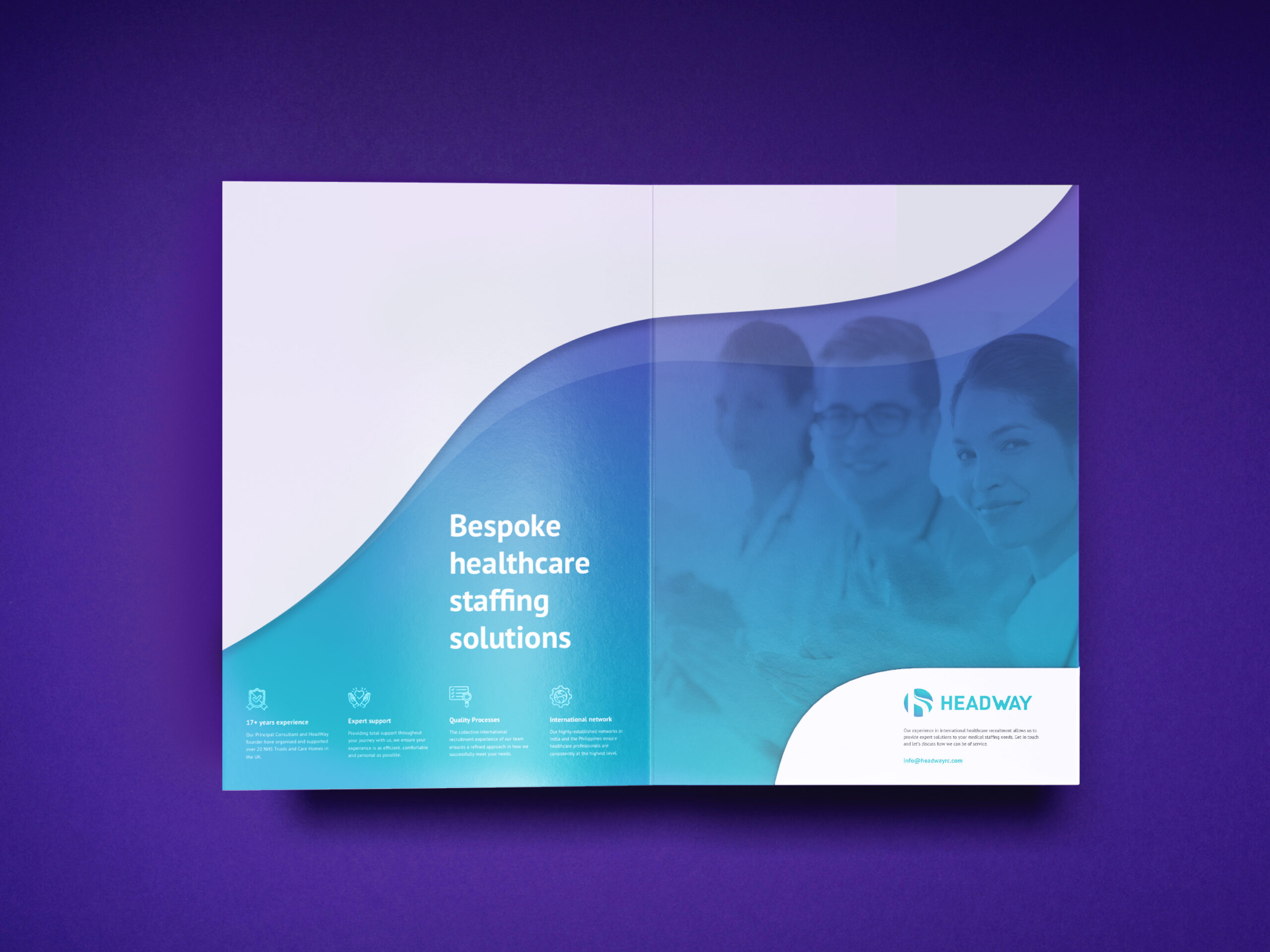
Once the website, hosting, and emails are set up, I designed HeadWay's business card and presentation pack to enable them to present to potential clients and investors.
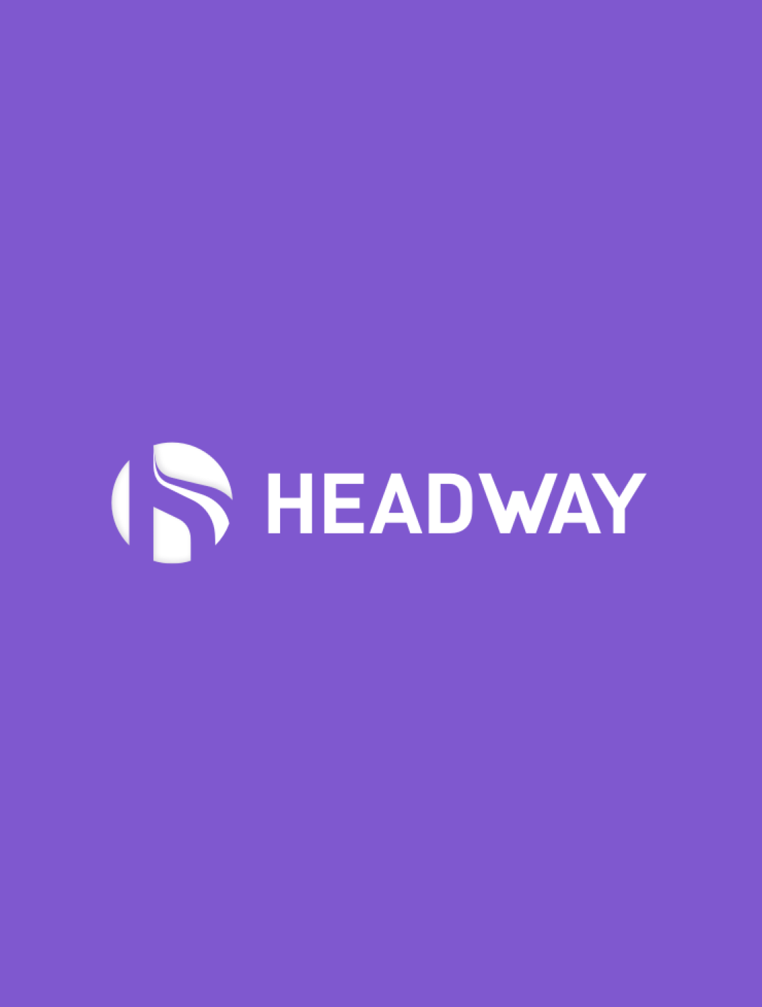
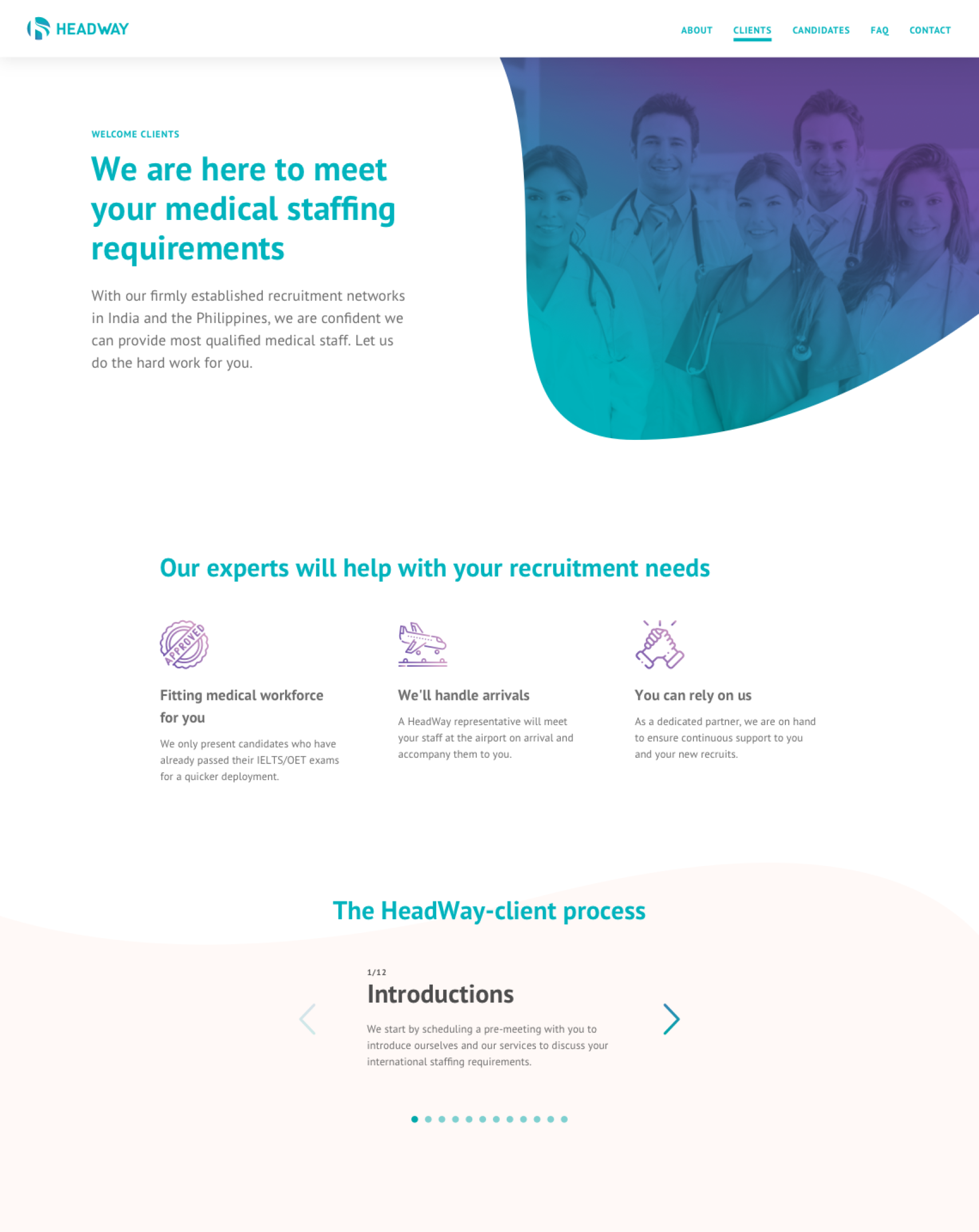
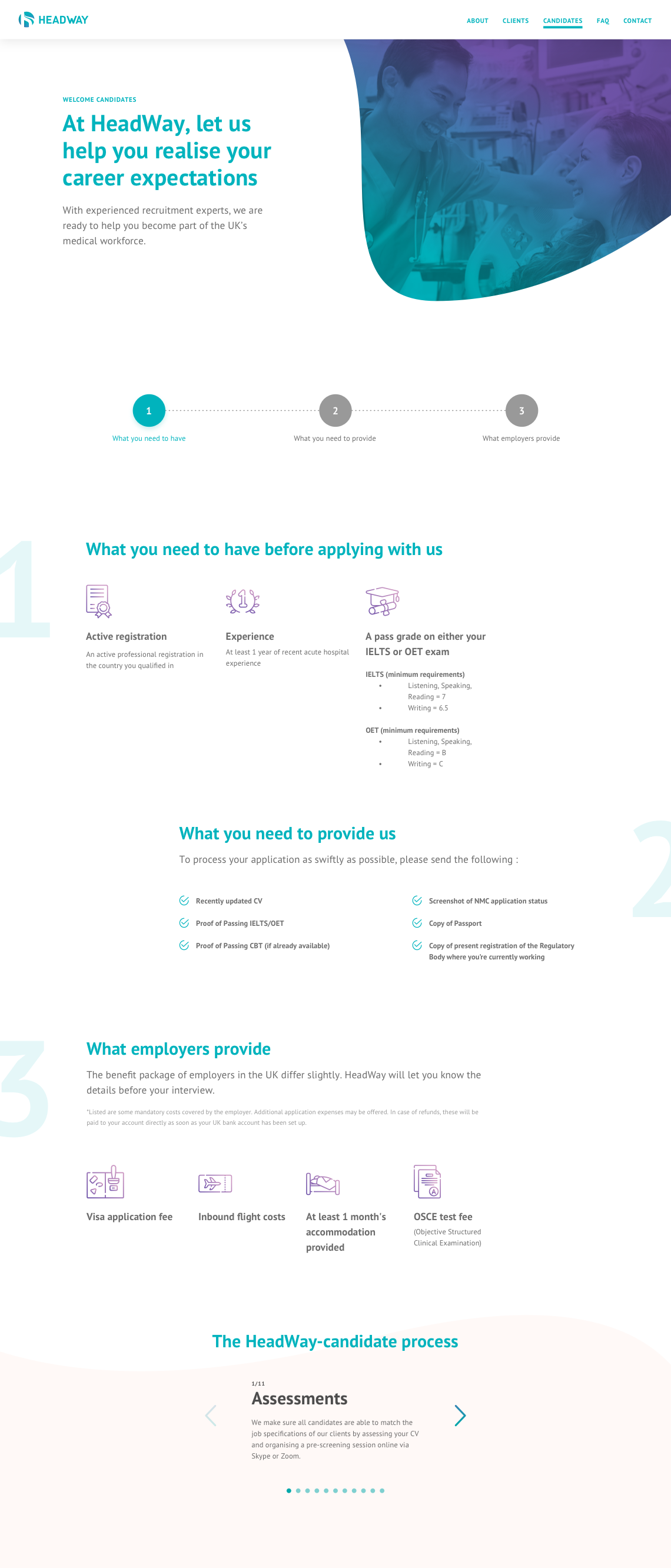
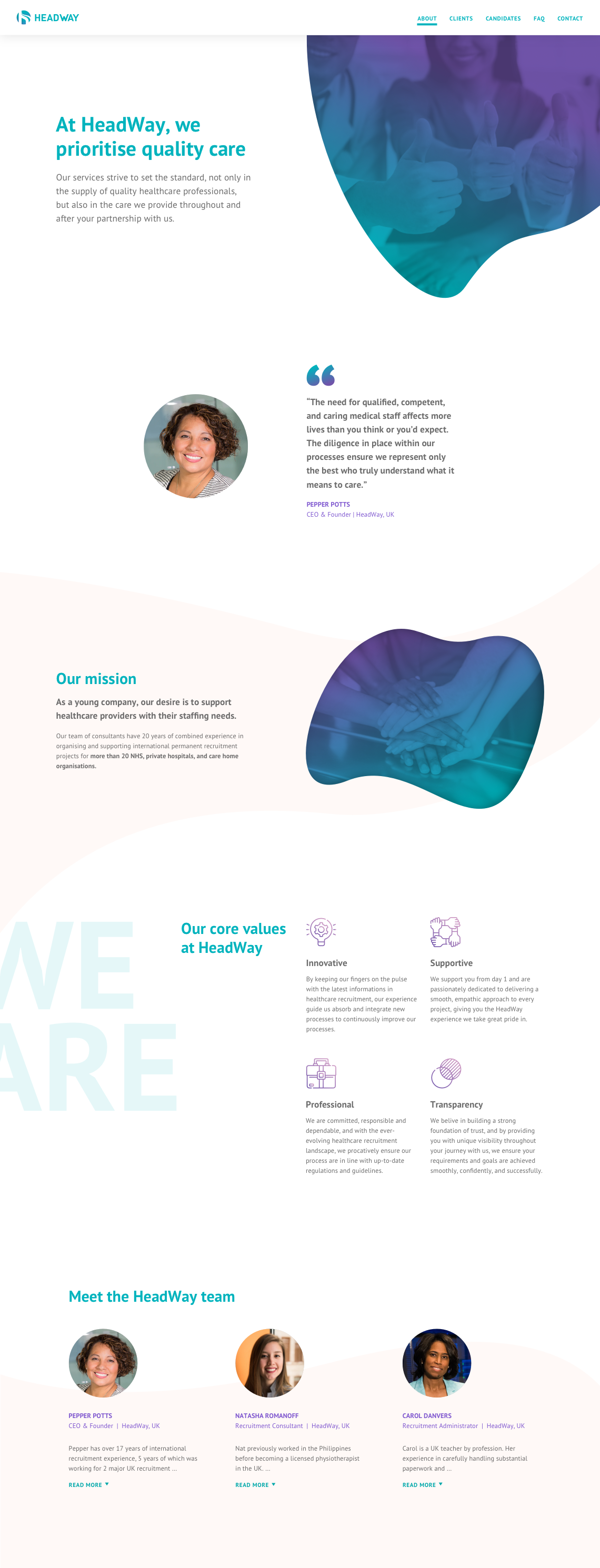
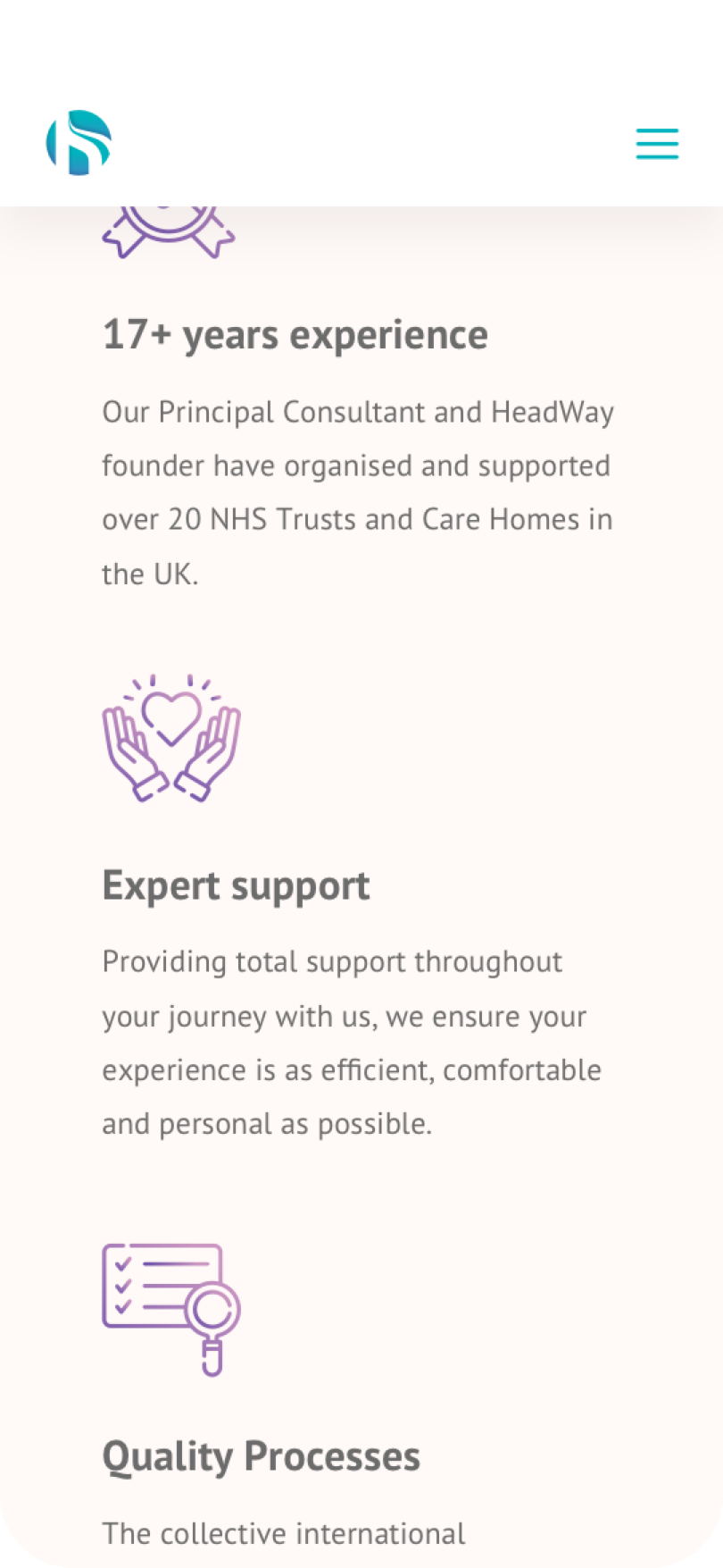
A clean, modern & versatile logo
Designed to reflect the HeadWay team's provision of smooth, clear and trustworthy customer journeys.

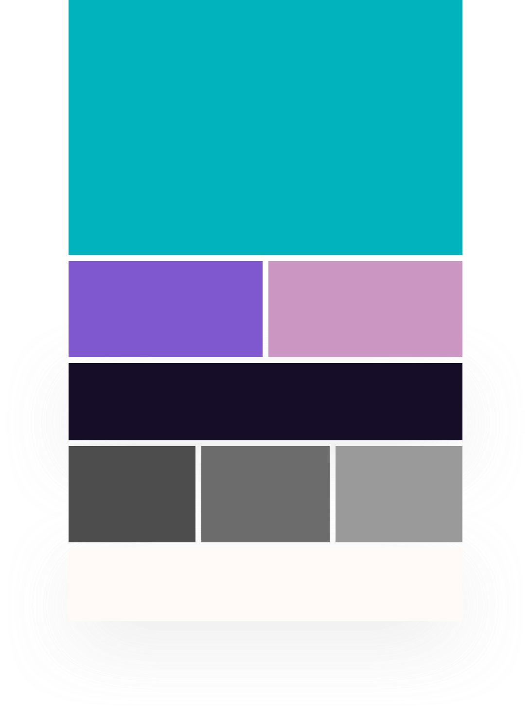
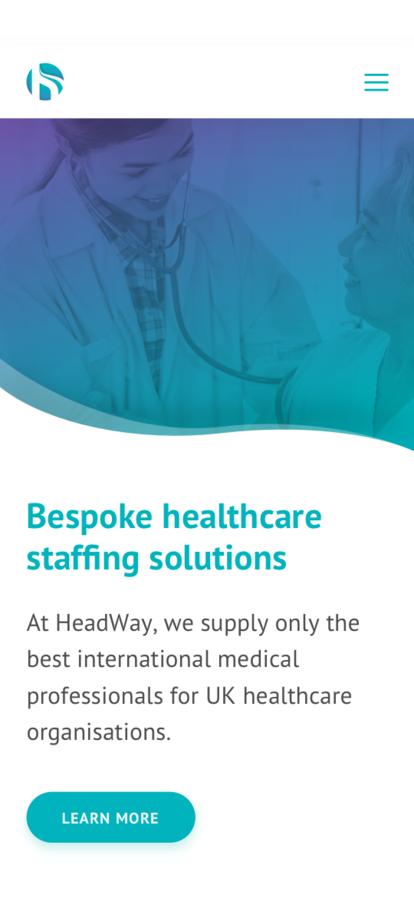
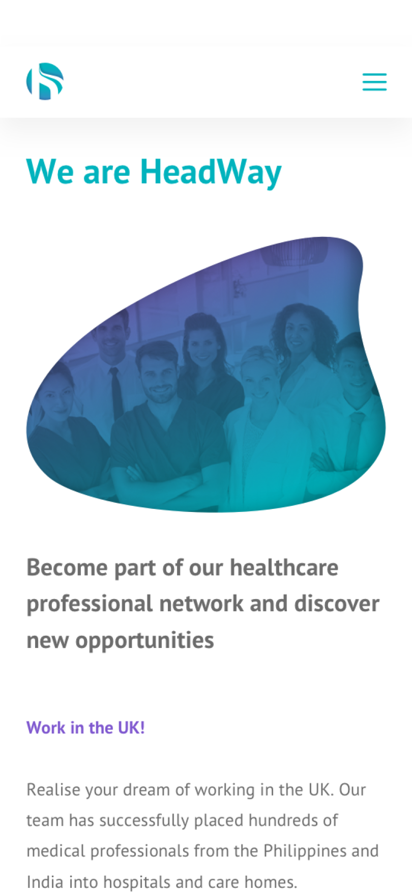
Vibrant colours
in healthcare
Using purple against the green and deep navy added a touch of contrast maximising brand memorability.
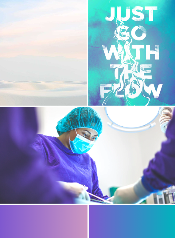
Visualising the "flow" element
Visualising HeadWay's USP using the blob shapes enable users to identify with the brand as friendly, unique and fluid. It also negates the stock image stereotype allowing for more identifiable and engaging imagery throughout the website.
Moving forward...
This was a great experience and was lucky enough to be given the freedom to create everything from top to bottom. I'm glad I did my due diligence at the very beginning and got the core research done as it made the following phases much smoother with concrete (yet flexible) foundations.
I didn't realise how difficult copywriting is, and I can't wait to get more experience and improve on this aspect in the future. Being the sole designer in such a giant project, I learned a tonne of things and improved my design knowledge, especially the positive effects of a well-considered visual hierarchy and the importance of white space.
There’s much more to come from HeadWay as they haven’t entered the social media landscape as of yet, so the only way is up for this promising business.
